.png)
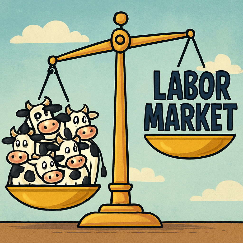
The Fed can’t fix beef prices with rate hikes, and the labor market just turned negative. Here’s the real story behind ADP’s new NER Pulse.
KEY TAKEAWAYS
-
Beef prices have soared 180% since 2007 and 64% since 2020 due to drought and fertilizer costs, not tariffs
-
Higher interest rates won’t fix food inflation–they may instead cause job losses
-
Fed officials continue to describe the labor market as “healthy,” but consumer anxiety is at a 40-year high
-
ADP’s new NER Pulse–a weekly payroll-based labor tracker–turned negative in late October.
-
The Fed risks keeping rates restrictive into a slowdown while ignoring real-time data
MY HOT TAKES
-
The Fed is fighting the wrong battle
-
Supply-side inflation can’t be solved with restrictive interest rates
-
ADP’s Pulse data is now more useful than anything from the BLS
-
The labor market’s cooling trend is unmistakable–and accelerating
-
Waiting for confirmation from lagging data could turn a soft landing into a hard stop
-
You can quote me: “ADP just handed the Fed a real-time warning–ignore it, and they’ll own the recession that may follow!”
Where’s the beef? If you are of a certain age, the line “where’s the beef” should evoke a special emotion. You should envision a typical granny posing the question to fast food companies after inspecting a tiny burger on a big bun. Thank you, Wendy’s for that great pop memory! This was well before “clean eating” became a thing… and beef prices were far lower. I actually tried to get a quick read for you on that, and the first index I found was from the USDA which tracks retail ground beef prices. Unfortunately, the data doesn’t go back to the 1980s when the commercial first ran, but you can easily get the message by noting that the price per pound has gone up by some 180% since 2007, so you could just imagine what that number would be like if we extended it back to the 1980s. Ouch! Oh, and to drive the point home, those prices have ratcheted higher since the start of 2020 gaining nearly 64%, that is a 9% annualized gain.
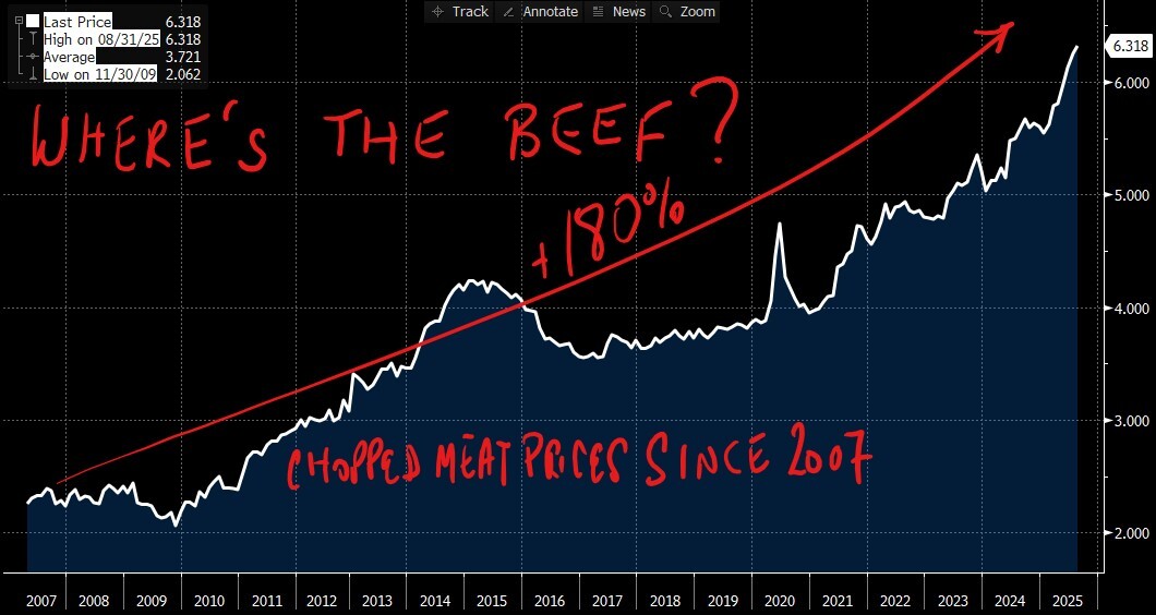
That is a painful looking chart, isn’t it? I want to just add one thing, then I will get into the meat 😆 of this morning’s message. Hey Fed, if you are listening, these meat price increases have nothing to do with tariffs! 😉 But, Fed, if you are worried about beef inflation, guess what, keeping rates higher for longer won’t fix the problem either! Got it? Beef inflation is due to lower supply and higher input costs. Lower supply because cattle herds are the smallest in decades due to drought. On input costs, feed cost is the culprit, which can trace its source to increased fertilizer costs. Remember that? It was a thing related to the Ukraine war… er, it still is a thing, OBVIOUSLY. Will restrictive interest rate policy make your hamburgers cheaper? Well, in fairness, they might. Consumers, facing higher borrowing costs, may revolt and stop buying hamburgers, forcing Wendy’s–of where’s the beef fame–to lower prices. Doing that would eat into its 62% gross margins and cause mayhem for the stock that has been under pressure since 2023. What can Wendy’s do? Well, they could lower costs by shrinking its burgers and risk the ire of the grannies from the commercial, or it could lay off workers! Uh oh, I said it. Hamburger prices would get lower but unemployment would rise.
I heard a Bloomberg interview the other day with St. Louis Fed President Alberto Musalem. He is one of two well-known hawks who are regular voters on the FOMC. He made it clear that he believed that the labor market was healthy. He was concerned about 3% inflation being higher than the Fed’s 2%. He also said that companies that he spoke with were able to deal with tariff-based input cost increases, so tariffs weren’t necessarily his top worry. Let’s zoom in on the healthy labor market.
Do you think that the labor market is healthy? If you are blessed with a job, are you growing concerned that employment will be tougher in months ahead? I know that you are. According to last week’s University of Michigan Sentiment release, 71% of households surveyed believe that unemployment will rise in the next 12 months. Check out this chart and keep reading.
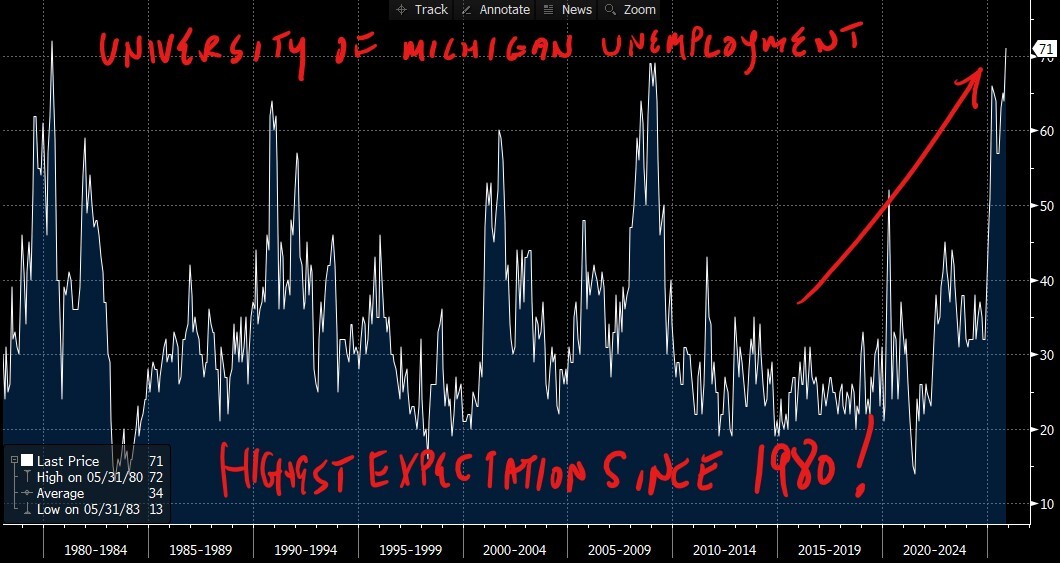
This chart should make it clear that anxiety about unemployment is the highest since 1980! That’s not a typo! Ok, ok, so what is really happening on the ground with the labor market. Unfortunately Musalem is using the same data that both you and I have. NONE–not from the Government at least. But, alas, the Senate has cleared the path to opening the government back up–assuming that the House approves the measure today. No guarantees as House Dems have vowed to fight it. But if the Republican caucus has no defectors, the bill should pass. Still there are no guarantees that we will get that critical data in time for the Fed’s December 10th decision. In his interview with Bloomberg, Musalem confidently said that he had “availed” himself of private data to help him in his assessment of labor conditions.
Well, we know about weekly first-time employment claims from the states, and that data has shown a continuation of the trend prior to the shutdown. High and staying high, but manageable. That only leaves the ADP number, which showed that after two months of losses, 42k new jobs were added last month. That should give us some cold comfort–even though it is far lower than a year earlier. But there may be more under the surface. Remember, it is a monthly number. Wouldn’t it be interesting to know the trend of those hires? Was it all in the first week of the month? Did it lose steam through the end of the month? Well, I would say at this very tender moment in the economy where it is quite clear that the labor market is losing steam, that being able to take a timely pulse of the labor market is ESSENTIAL. Enter ADPs newly announced NER Pulse number.
The ADP NER Pulse is one of those rare new datasets that feels like it arrived exactly when we needed it most–when the government’s statistical machine has gone dark and when everyone from policymakers to investors is desperate for any real-time insight into what’s happening in the labor market. If you’ve been following along, you know that I’ve been warning about the growing cracks beneath the surface of those “still strong” employment numbers that officials like St. Louis Fed President Musalem continue to cite. So, the timing of ADP’s new release is nothing short of critical.
Here’s the essence of how this new metric works: the ADP NER Pulse takes the massive pile of real payroll data that ADP processes–covering roughly 26 million private-sector workers–and distills it into a weekly rolling estimate. Each Tuesday morning, ADP now publishes a four-week moving average of total private employment change. That makes it the closest thing we have to a near-real-time employment gauge, essentially a labor market EKG. It’s an extension of ADP’s long-standing National Employment Report, which is released monthly, but instead of forcing us to wait for the first Wednesday of every month, we can now track the heartbeat every week. 🥳
Each week’s Pulse number is labeled “preliminary,” but it is based on actual payroll changes which includes hires, separations, and pay cycles, and they are aggregated across ADP’s nationwide client base. It’s not a survey, it’s a data feed from employers who cut paychecks. Because of that, it doesn’t rely on the same sampling assumptions that the Bureau of Labor Statistics uses. It’s not subject to the same collection lag, nor is it disrupted by a government shutdown. What it offers instead is an unvarnished, directionally reliable view of what’s happening on the ground in hiring.
Now, let’s look at the numbers that matter. The latest ADP NER Pulse, covering the four weeks ending October 25, showed that private-sector job creation not only slowed, but it turned negative, registering an average decline of roughly 11,250 jobs per week. That’s the first outright contraction since ADP began publishing the weekly series and marks a sharp reversal from earlier in the month. The chart tells the story clearly: what began as modest growth in late September gave way to consistent losses through mid- and late October. The line slopes decisively downward, signaling that the labor market lost steam as the month progressed.
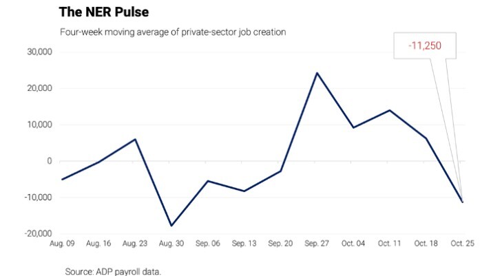
What this suggests is not a one-off data blip but a change in trajectory. The deterioration in late October is consistent across industries and regions, implying that businesses are pulling back on hiring or beginning to trim staff rather than simply pausing new additions. In other words, momentum didn’t just cool–it rolled over. That raises the likelihood that November’s Pulse, which will cover the weeks into early November, could post another negative print, reinforcing the view that the private labor market is weakening faster than the official data can show.
This is why trend analysis matters more than the headline number. Anyone who has followed ADP’s monthly reports knows that the absolute level rarely matches the Bureau of Labor Statistics release to the decimal. But when ADP’s underlying direction turns negative, the BLS inevitably follows within a month or two. It’s not about precision; it’s about trajectory. And right now, the trajectory is pointing south.
The Pulse’s decline also lines up uncomfortably well with what we’ve been hearing anecdotally from corporate earnings calls and PMIs–slower hiring, tighter budgets, delayed expansion plans, and more references to “workforce optimization.” That’s the polite corporate term for layoffs. It’s also consistent with the University of Michigan survey showing record-high household anxiety about unemployment. The combination of consumer fear and employer restraint is the recipe for a self-reinforcing slowdown.
So, what happens next? If the NER Pulse continues to print negative through November, it would mean the private-sector economy is already contracting in labor terms–well before the official BLS payrolls confirm it. That would place enormous pressure on the Fed ahead of its December 10 meeting. Policymakers won’t be able to hide behind the usual “data dependence” excuse; the data is right here, arriving weekly, in plain sight.
The Fed has repeatedly said it wants to “see evidence” that the labor market is cooling before it changes course. Well, here it is. The handwriting is on the wall, and it’s being updated every Tuesday morning at 8:15 a.m. If the central bank truly wants to “avail” itself of timely private data–as Musalem himself claimed it had–it should pay close attention to these numbers. Waiting for confirmation from the government’s monthly reports risks being too late. By the time those lagging indicators finally show a downturn, the damage to employment, income, and confidence may already be baked in.
For markets, that weekly pulse has now become the canary in the coal mine. The bond market is likely to respond first, pricing in a higher probability of rate cuts as employment softens. Equities, for now, may cheer the prospect of looser policy, but if job losses accelerate, that optimism will quickly fade into earnings downgrades. The point is: the signal is clear, the direction is negative, and the window for pre-emptive action is narrowing.
So yes, the labor market that may have looked “healthy” a few weeks ago from St. Louis is now showing visible fatigue. Job creation is no longer positive, and ADPs new Pulse is flashing warning lights. This isn’t panic, it’s the natural consequence of policy staying tight for too long. The Fed wanted evidence of cooling; it’s now staring at a chill.
The takeaway? Watch Tuesdays. Every week’s release will tell us whether the economy’s heart rate is stabilizing or still slowing. The trend will determine the Fed’s December decision and, ultimately, how soft this “soft landing” really is.
And for anyone wondering whether these numbers will ever make their way into the Fed’s calculus, let’s hope they do, and soon. Because ignoring a negative labor pulse while insisting the patient is fine is not prudent medicine! 👀
So, as we keep our eyes on the Tuesday updates and our ears tuned to the Fed’s next move, let’s bring it back to where we started. If policymakers want to know what’s really happening under the hood of the U.S. economy, they don’t need another model, they need to look at this chart. 🙃 The data is right there, sizzling on the grill.
Here’s the beef.
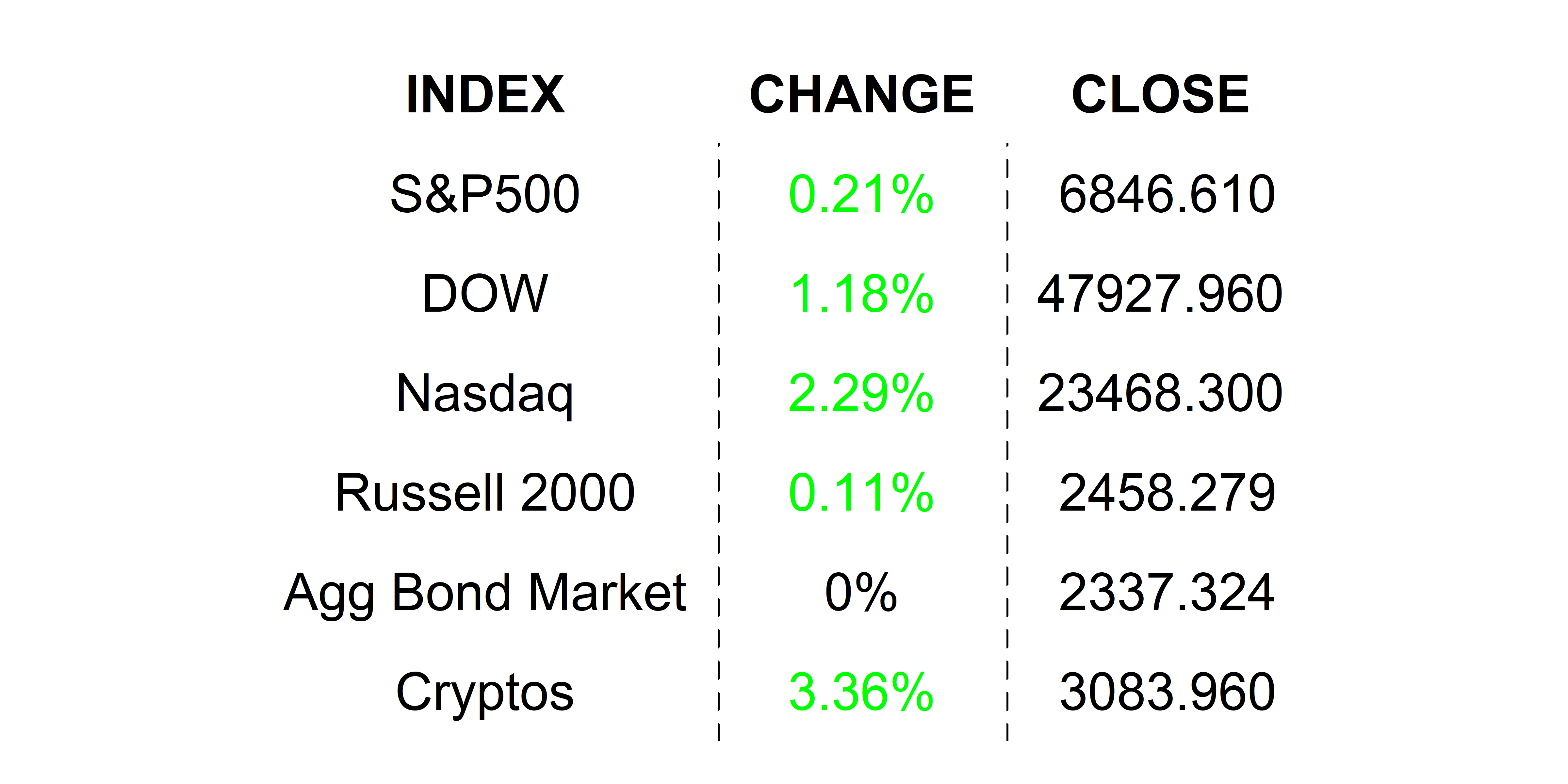
YESTERDAY’S MARKETS
Stocks had a mixed close, and the Dow hit an all-time high as anxiety still looms large around AI valuations. I was proud to be a bell ringer on the NYSE yesterday as we watched the Dow close, but I could also see the Nasdaq print close in the red, which was largely driven by the NVIDIA news that Softbank was selling its shares in the company. Bond markets were closed for Veterans Day.
NEXT UP
-
No economic data today, but the House is expected to vote on the Senate's budget measure today, so hopefully the numbers will start flowing again as soon as tomorrow–stay tuned.
-
Lots of Fed chatter today from Williams, Paulson, Waller, Bostic, Miran, and Collins.
-
Important earnings today: Circle, TransDigm, Flutter Entertainment, Firefly Aerospace, and Cisco Systems.