.png)
Strong Data. Nervous Markets. A Year Dominated By Policy Risk and Uncertainty.
KEY TAKEAWAYS
-
One-year market performance masks deep policy-driven tension
-
Strong economic data failed to translate into confidence
-
Tariff risk dominated market psychology
-
April second was a true repricing event
-
Uncertainty remains the core driver
MY HOT TAKES
-
Markets were right to discount policy over data
-
Relief rallies were about negotiation–not growth
-
Volatility declined but never disappeared
-
Geopolitics now sit alongside macro as a primary input
-
Confidence is the most fragile asset
-
You can quote me: “This wasn’t a bad data year–it was a bad certainty year.”
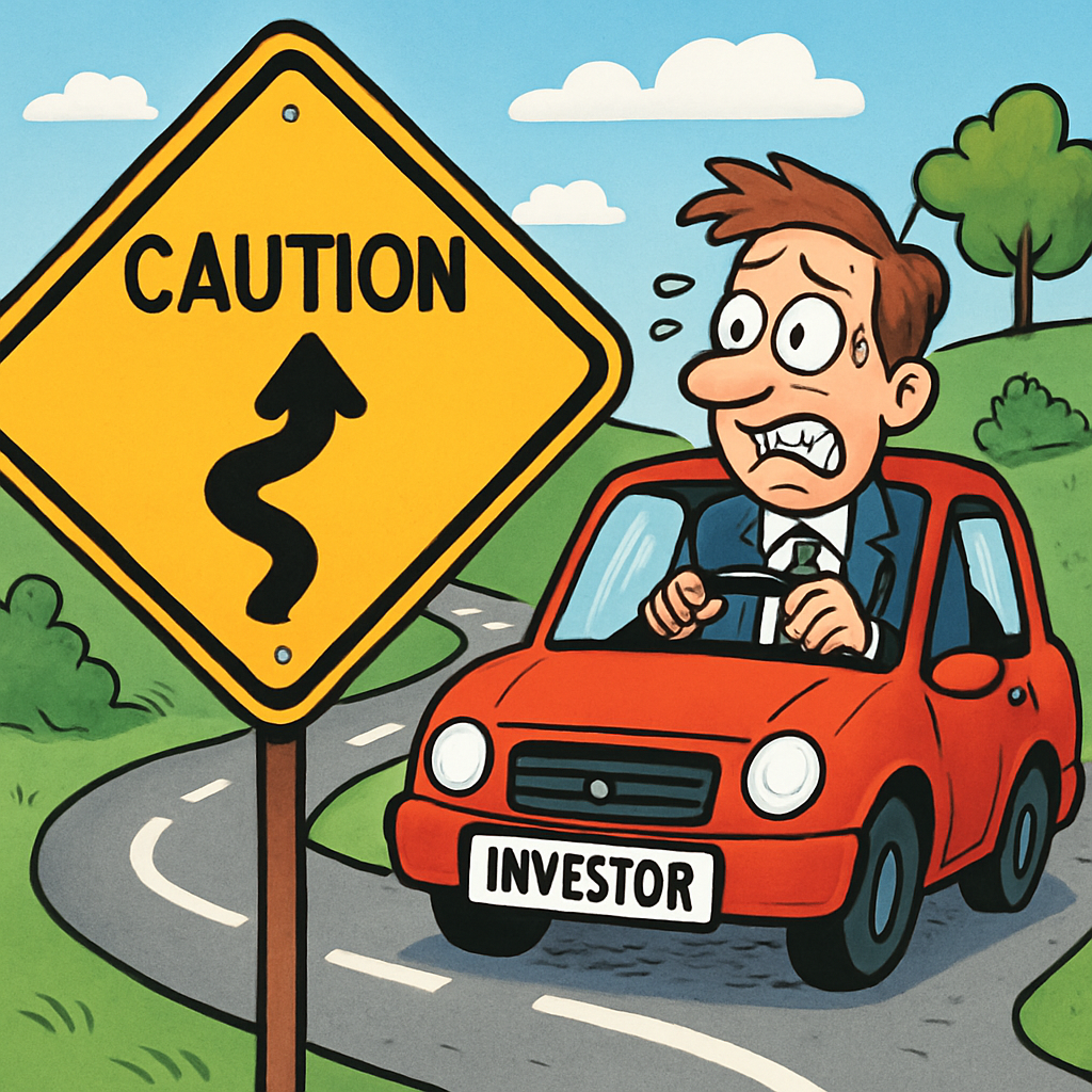
No rest for the weary. I don’t know about you, but I am still putting 2025 in all my dates. It’s early yet, so I am not going to up my morning dose of vitamins just yet; I’ll give myself until at least the first of February for my brain to sync up. I am pretty sure I have used the tagline, “Long and Windy Road” once or maybe even twice before, and I am also sure that some of my colleagues on the street who have caught on to the pop song references I often employ have used this one as well. It’s unavoidable actually. Markets have been windy, bumpy, rocky–even treacherous this past decade. It has been a pretty good one, but it certainly did not come without its low points. That said, today being the 1-year anniversary of President Trump’s inauguration, I wanted to do a quick lookback over the past year and call out 5 high/low points. I realize that there have been FAR more than 5 defining moments, but I am making a concerted effort to keep things simple. Let’s go–seatbelts fastened for your safety.
Here are three charts, have a quick look and keep reading.


And there you have it–A Year in the Life (gotcha’ copycats, as I loosely reference a Beatles song with similar title. I plotted the S&P 500 (chart with blue line), the 10-year Treasury yield (chart with green line), and the VIX Volatility Index (chart with orange line) over the past year. I suppose, I could have just said that the S&P gained 15.73% (through Friday’s close), 10-year yields are lower by 36 basis points (0.36%), and that the VIX is pretty much unchanged. If I did that and added that inflation is generally lower, mortgage rates are lower, gas is cheaper, eggs are cheaper, and GDP is higher, you might decide to throw a party, but of course, that wouldn’t tell you the whole story.
Overall investor optimism was somewhat high leading up to the inauguration. Trump was, after all, a business-friendly President who notoriously used the performance of the stop market as a scorecard in his first stint in the White House. That would be the basis of the so-called “Trump Put.” The Fed has recently pivoted and had cut rates later in 2024, which was a positive for markets. The Republican election trifecta almost guaranteed some sort of fiscal stimulus. Regulations? Trump hates regulations, so we would have expected a more business-friendly regulatory environment. The President would embrace crypto which is synonymous with everything bullish and speculative–which would interestingly serve as a catalyst for growth in the broader markets. AI was in full swing, and the President would surely embrace that as well. The price tag for all that awesomeness would be a jump in the deficit–a bit of a drawback. But, alas, President Trump had a solution for that in DOGE and his bromance with Elon Musk. This past year had “win-win” stamped all over it, and I suppose, as I alluded to earlier, it was a win. Lower yields, market gains, and almost no change in volatility (which some folks use to classify risk). It is important to note that the President, just days into his second tenure in DC, announced that he would be bringing back his old favorite “tariffs” in short order. Markets and volatility from that point on were under this influence of gravity from that very catalyst. Let’s get a bit more granular with my 5 high- / low-lights of the year.
The February CPI print should have been a straightforward positive. On paper, it was. Inflation wasn’t reaccelerating, and the data reinforced the idea that the disinflation process was still intact. Under normal circumstances, that combination would have supported higher equity prices and a calmer volatility backdrop. But that’s not what happened. As the charts show, the S&P 500 did not surge higher, and the VIX remained elevated. Markets were already discounting something else–not in the data, but in the policy outlook.
By mid-February, the prospect of aggressive trade actions was already hanging over markets. Investors weren’t willing to lean into the CPI relief because they understood that inflation data can be overwhelmed by policy-driven price shocks. In that sense, February’s CPI was a high point economically but a warning sign for markets. The fundamentals were cooperative, yet prices refused to reflect it. That disconnect matters.
The March jobs report tells a similar story. Strong payroll growth, steady labor demand, and no immediate wage spiral should have been enough to push risk assets higher and volatility lower. Instead, the charts show a market that stayed cautious and a VIX that remained stubbornly above 20. This wasn’t a market worried about recession. It was a market worried about policy.
That distinction is critical. By early March, markets were already operating with a mental foot on the brake. The economy was doing its job. The labor market was holding up. But investors were increasingly aware that strong growth could actually make policy outcomes more disruptive, not less. The jobs report was a high point in isolation, but it failed to translate into confidence because tariff risk was already in the price.
April 2 was when that risk crystallized. Liberation Day didn’t introduce a new fear–it confirmed an existing one. The tariff announcement, especially the headline 145% levy on China (that came a few days after Liberation Day), validated what markets had been quietly preparing for all along. The reaction in the charts is decisive. Equities sold off sharply, yields moved higher as inflation risk was repriced, and volatility surged. This was not an overreaction; it was what we on Wall Street politely refer to as: a repricing. That repricing sent the S&P to a close below the important 5,000 psychological level.
What makes this a true low point is that it removed ambiguity. Until then, tariffs were a probability. On April 2, they became policy. Markets don’t like guessing, but they dislike sudden certainty even more when the outcome is disruptive. Liberation Day was the moment when concern became reality.
The relief rally on April 9 needs to be understood in that context. This wasn’t a return to optimism. It was a recalibration. When the administration signaled flexibility and potential moderation, markets responded immediately. Stocks rebounded sharply, and volatility compressed, but neither returned to pre-year complacency. The charts show improvement, not resolution.
This high point was about risk management, not enthusiasm. Investors weren’t pricing out tariffs; they were pricing in negotiation. That distinction explains why the rally was powerful but fragile. The market wasn’t celebrating growth. It was celebrating the possibility that the worst-case policy path might not be the base case.
Those conditions persisted for most of the remainder of 2025 where we witnessed a systematic decline in volatility and Treasury yields as well as a relatively steady climb in equities. There were a few bumps later in the year which were largely driven by overvaluation fears in mega-cap AI stocks and a subsequent broadening out rotation. I didn’t give this “datapoint” status as these were the markets doing what the markets should be doing–discounting in facts and market sentiment–regardless of policy. We can see that play out in the 2 spikes/drops in the VIX and S&P in Q4.
The final event, the early January arrest of Nicolás Maduro, underscores how sensitive markets remained to non-economic shocks. By this point, investors were already conditioned to expect volatility. The charts reflect that. The VIX moved higher again, equities hesitated, and yields reacted to another layer of geopolitical uncertainty. This wasn’t panic, but it was tension.
Importantly, the reaction was uneven. Energy-related assets initially benefited, while broader risk sentiment softened. That didn’t last too long following an announcement that trillions of dollars would be added to the defense budget, which provided initial support to equities–though the long-term impacts are still being assessed by the markets (interestingly, there is evidence that hedge funds have already made up their minds, piling into Industrials). The mixed response is exactly what you’d expect in a market that has learned to compartmentalize shocks. The Maduro event didn’t change the economic cycle, but it reinforced the reality that markets were operating in a policy and geopolitics-heavy regime.
Taken together, the charts tell a story of restraint rather than exuberance. Economic data consistently argued for higher prices and lower volatility. Markets consistently refused to comply. That tension– between what should have happened and what did happen–is the defining feature of the year.
And now, just as we mark the one-year anniversary and attempt to tie a bow around this lookback, the weekend headlines remind us that this story isn’t finished. The President is reportedly threatening large tariffs on European Union countries tied to Greenland. That development is not reflected anywhere in the charts you just looked at. It can’t be. Markets haven’t had a chance to process it yet. And that’s the point.
What happens next? Who knows. Maybe it’s posturing. Maybe it’s leverage. Maybe it’s real. Markets will decide soon enough. But if there’s one lesson from the left-hand side of these charts, it’s that uncertainty itself can be enough. Look back there. 🙃 That’s where we saw the highest concentration of unknowns, the most tension between strong data and nervous pricing, and ultimately the path toward the annual lows. Fundamentals didn’t break first. Confidence did. Is there another Beatles song reference here (when we get to the bottom and go back to the top of the slide)? I will leave that up to my colleagues.
That doesn’t mean we’re headed for a repeat. It does mean that this ride is far from over. Policy remains the dominant variable. The economy continues to do its part. Markets are stuck in between, forced to discount both at the same time. No rest for the weary.
FRIDAY’S MARKETS
Stocks traded off on Friday reflecting general policy anxiety. Earnings season was off to a solid start, but it is early days, and headline risk looks large over the markets looking for a reason to grind higher.

NEXT UP
-
ADP NER Pulse (December 26th) came in at 8k new jobs added on average over the past 4 weeks. That represents a slowdown over the last print of 11.25k additions.
-
Later this week, earnings announcements ramp up and we will get more housing numbers, some stale econ numbers, PCE Price Index, flash PMIs, and University of Michigan Sentiment. Download the attached calendars so you can anticipate bumps in the road–good luck with that.
-
Important earnings today: 3m, Key Corp, DR Horton, Fifth Third Bancorp, US Bancorp, Fastenal, Interactive Brokers, Netflix, and United Airlines.