.png)
Yield curves don’t lie—until they do. What this week’s strange flattening is signaling.
KEY TAKEAWAYS
-
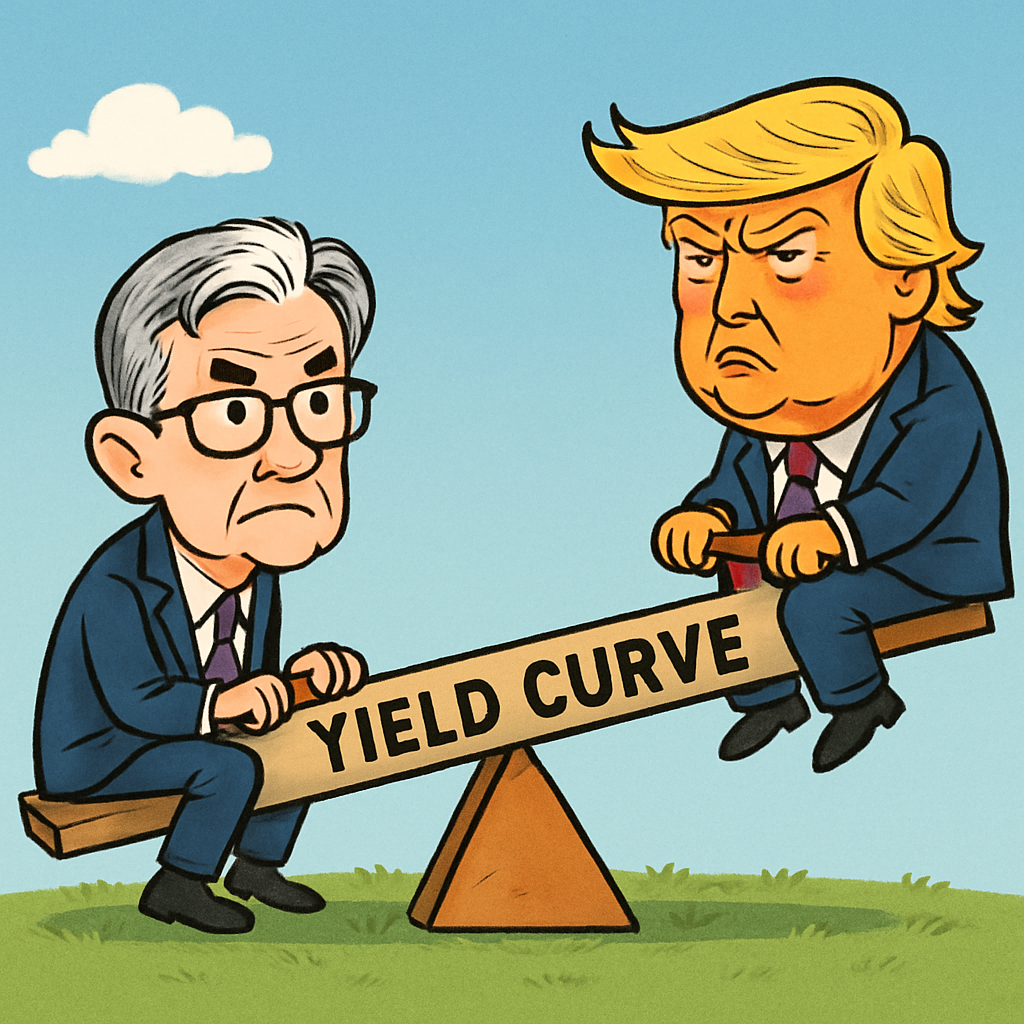
The yield curve acts like a seesaw, balancing Fed policy on the front end and market forces on the back end
-
Under normal conditions, it slopes upward, compensating for long-term risk and inflation
-
Flattening or inversion often signals recession, though the latest inversion didn’t
-
Recent Fed cuts and rising risks have steepened the curve, but it just flattened again unexpectedly
-
This flattening is a critical signal to watch ahead of upcoming market events
MY HOT TAKES
-
The yield curve is Wall Street’s best early-warning system–and it’s acting weird right now
-
This flattening makes no sense given the macro backdrop, which means it’s worth watching closely
-
Markets may be doubting the Fed’s willingness to cut as much as expected
-
Every time the curve shifts in an odd way, equities tend to follow–brace yourself
-
Like a seesaw prank from childhood, the curve can dump you hard when you’re not paying attention
-
You can quote me: “The yield curve is the market’s x-ray machine, and right now the picture looks blurry.”
Seesaw. We use that word seesaw a lot on Wall Street. Some of my friends growing up call it a teeter-totter. Regardless, when I look at the US Treasury yield curve, I often think of it as a seesaw. I talk about the yield curve often, and I’m sure you have heard it being mentioned on TV or read it in the press.
If you haven’t, let me explain. Imagine charting US Treasury bills, notes, and bond yields of different maturities on the same chart with the maturities on the x-axis (bottom) and yields on the y-axis (left). Next, draw a line connecting the yields of each maturity. Got it? Great! This exercise should help you understand term premium, something I covered in a newsletter/blogpost recently. You would expect to get higher yields for longer maturities as you are taking greater risk by locking up your principal for longer periods of time. More can go wrong, the longer you agree to wait to get your principal back. That is why we expect the yield curve to be upward sloping–greater yields for longer maturities.
Now, there are some important mechanics to understand when it comes to bond maturities. Shorter maturities are heavily influenced by the Fed, which sets overnight rates. Longer maturities are under the control of market forces. As you get further out on the yield curve–longer maturities–the markets have a greater influence. If investors are expecting economic challenges in the future yields of longer maturities typically decline in anticipation of future Fed action. Another factor influencing longer-term maturities is inflation expectations. If investors are expecting higher inflation, they need more yield to compensate for their future loss of purchasing power. Think of it this way: if you’re going to lend Uncle Sam money for 10 or 30 years, you want to be sure you’re not getting paid back in dollars that buy fewer groceries and fewer tanks of gas. That’s why the long end of the curve is such a critical signal–it tells you how investors feel about not just the economy, but about the value of money itself over time.
So, you can see that the yield curve tells us what the Fed is up to today and what it is expected to do in the future. It also tells you how much future risk is perceived by investors as well as their expectations of future inflation. Based on that alone, one would expect the yield curve to be quite fascinating in the current economic environment in which all of those factors are up in the air.
Under “normal” conditions, a yield curve is upward sloping. As perceptions of future economic strife grow, yield curves flatten and sometimes invert with longer maturities yielding less than near-term ones. This is rare, but it is an artifact of markets moving faster than the Fed. The Fed, which is “data dependent” is typically slow to alter policy which affects the front end of the yield curve. It remains anchored while markets push longer-maturity yields down, and the curve inverts. If we observe history, we see that this rare inversion occurrence predates recession with a high probability of success. If we look really closely, we see those inverted curves quickly normalize and steepen just as recession begins. This is the result of the Fed lowering rates aggressively–usually too late–causing the front end of the curve to move down faster than the back end, controlled by the markets. Once recessions pass and economic conditions improve, yield curves typically steepen to reflect expectations of inflation. Remember inflation comes from an “overhealthy” economy. Check out this chart and keep reading.

This is a chart of the 2-year/10-year yield curve. It is simply the difference in yields graphed (white line) over time. You can see how the difference turned negative (circled in yellow) ahead of each recession (shaded in red) on this chart. Those are the yield curve inversions I talked about. You can also note how the curve flattens and steepens in a cyclical fashion. But wait, did you notice how the yield curve was extremely inverted recently, but no recession followed? That was the result of abnormally low 10-year yields with Fed Funds on the rise and held high. Remember, the 2-year moves with Fed policy and the Fed’s aggressive tightening in 2023/2024 pushed the front end of the curve up, while 10-year yields moved up at a slower pace. This would change when the Fed pivoted and began to cut rates last year causing the curve to steepen. But that’s not all that happened since the Fed began to ease rates.
This current year has been marked with some geopolitical challenges–expanding tariff policy, geopolitical risk, rising deficit expectations, a stubborn Fed–let’s just call them perceived risks. Remember what we talked about above? More perceived risk needs to be compensated for with higher yields. Hence we saw the curve steepen further. Adding to that is a Fed that seems to be getting closer to resuming its cutting causing 2-year yields to fall. Both together have caused the yield curve to steepen recently. That can be observed on the far-right-hand side of the above chart.
Based on that, one would expect the curve to continue to steepen as future risk remains high and the Fed continues to cut. Many institutions place bets on this continued steepening. If you look at the far-far-right, the very end of the line, you can see that it has tailed down a bit. In fact, if you zeroed in to a more granular view, you would see that the curve went from 85 basis points to 60 basis points in a little more than a week–it flattened noticeably. That has left market strategists scratching their heads.
In the past week, employment numbers have almost crystalized stronger prospects for rate cuts later this year and possibly next year. Inflation numbers suggest rising inflation, and one could hardly argue that geopolitical risk and market risk has eased in the past week. Given that, one would have expected the curve to steepen in the past week, but yet it flattened. Is the market lowering its expectations of Fed rate cuts in the near term, despite the past week’s weaker-than-expected job data? Is the market toning down its worry about risk and term premiums required? Is this just a typical undulation and will the curve ultimately revert back to its expected steepening? It’s too early to tell, but it is an important signal to watch, as weird shifts like this in the curve typically predate equity market moves.
I remember playing on those seesaws as a kid. A common gag would be to slip off your side and let the other side come crashing down catching your friend unaware… and usually with a sore rear end. Keep your eyes open and stay vigilant. We have a big week coming up, and you can bet that the yield curve will certainly be… er, fluid next week, but I wouldn’t bet on which direction.
YESTERDAY’S MARKETS
Stocks rallied yesterday as equity traders amped up hopes for Fed rate cuts next week. An on-the-mark CPI print left a “could have been worse” taste in traders’ mouths, good enough for a rally. Bond yields are on the move keeping bond traders and market watchers on edge.

NEXT UP
-
University of Michigan Sentiment (September) may have slipped to 58.0 from 58.2.
-
Next week we will get Retails Sales, housing numbers, Industrial Production, Leading Economic Index, and regional Fed reports. The main attraction will be the FOMC meeting and the Chairs presser. Check back in on Monday for your very own calendars and the chance to be one step ahead of your friends.